Category Archives: #4 Seen in the Real World

Blog Assignment #4

Diet Coke; Over the Centuries – Seen in Real Life.

Over the years the logo of Diet Coke has evolved alongside its consumers. Seemingly effortless the design has continuously changed. The incredibly rich company pours a significant amount of money into marketing and researching how their product will sell best.

image1.jpeg

I chose Diet Coke for this example because Coca-Cola, as an original, has had less room to navigate change.

Did you notice the marketing change? Or did it always feel as though Diet Coke products looked just this way?

Take a quick look at how it’s changed over the years, and had been brought to a thick “high line” in which the typography is bold separated and in the words of Elyse Larouere, designer of the 2016 share a coke campaign, “It’s the graphic equivalent of Diet Coke’s confident, self-driven attitude.” Source.


DKOevolution2.gif

Real World

I think the design of this juice pouch is really nice for a few reasons. I like that the background is white and the company name is black, creating contrast for the most important information. It’s clear the designer thought about his/her audience (kids) because it has bright colors, fun graphics, and kid-like handwriting. Also, something I didn’t notice right away, the “i” in KIDS is actually the tip of the splash. A lot of thought was put into this clean and effective design.

IMG_3061.JPG

Seen in the Real World


This graphic design was from a protein powder box I had in my pantry. This design stuck out to me due to its creativity with the typography. Looking at the logo alone, the clean look from using simply the text makes it an effective logo. I love the way they made the word ‘fit’, fit tightly in between the other letters. Also, the contrast between the black, white, and red really makes it stand out. As for the design on the rest of the front of the box, emphasis is properly put on the logo, then to the picture, and finally to the smaller details. There isn’t an overcrowding of information, but still includes necessary details. Overall I love this design, logos that include designs with only text are usually my favorite because of how simple, yet strong they can be.

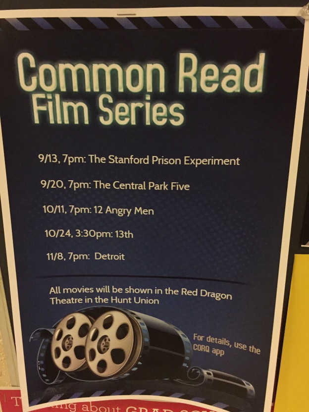
Real Life Poster

What I enjoy about this poster is the theme. The theme is something that is illustrated throughout the poster and stays consistent with the images, border, and text. The text title is something that is bolded and almost glowing to pop off the page and grab the viewers attention. The text explaining time and dates is a nice white color to pop in the dark background as well. Another part I like about the poster is the striped border on the top and bottom of the poster. When I saw it my mind thought off a movie reel. It appears to almost come right off the image of the movie reel itself. The Last thing I like is the arrangement of the pieces in this poster. The image is centered as well as the text and almost draws you in at the top and slowly brings you down the poster until you reach the bottom of the poster.

Seen In The Real World

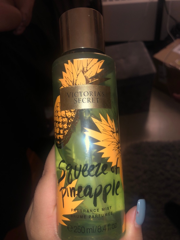
As seen below, I snapped a picture of my favorite perfume. The label covering the bottle is an example of graphic design in the real world. When I purchased this perfume, it was the summer time. Not only do the pineapples represent the scent but it is also reminiscent of the summer. The design is very fun and bright, getting the consumer ready for the occurring season. The font on the scent’s name, “squeeze of pineapple,” is also very playful, attributing to the summer festivities. As the consumer, during the summer I like to be literally enveloped in only summery products. The design of this bottle, its illustrations, and fonts can easily be associated with the summer, therefore it was very likable to me and many others. If the design was not there and if there were no pineapple illustrations I definitely would not have bought this. Or perhaps if this was available in the winter per say, I would not feel pressured to buy.

IMG_6775

Gnome Bath Bomb

I was initially attracted to this item because it would be something I’d buy for myself, or as a joke gift. The packaging is simple but they have a font that you would expect to come with a funny gag-ish gift, but it’s not so much a joke that they used a “stupid” typeface like Comic Sans. The packaging has a lot of white space and the text is short and sweet, so your eye goes immediately to the caricature of a gnome peeking out from the grass. The type and the image makes it clear what the object is that you’re buying and also looks pleasant enough to make you believe it’s not going to burn your skin alive if you put it in a bath and then bathe in that gnome water (which would seem to be the case in the scenario that the packaging looked like crap). The company’s logo looks reputable but also simple.


IMG_8013.JPG

Seen In the Real World

This is a can of fixative that I have seen many times. I like how the intent of their design is to make it relatable to artists by having the cup with art tools in it. I also like the choice in colors and fonts because it displays a nice a clean and finished feel, which works nicely because it is a fixative spray that is used once a project is completed. My only critique is that the photo can be misleading because there are paintbrushes depicted on the can itself when the fixative itself is not supposed to be used for paint; only pencil, charcoal, chalk and pastels.

Tostitos Logo

IMG_1646

I find it funny because I eat Tostitos chips very often and never noticed their logo until just recently. As you can see, the company used the middle t, i, and t to represent two people sharing chips and salsa. I find it very interesting and creative how they got the idea to have the two t’s represent people and the i be some sort of table that holds a bowl of salsa. I also think that the red and yellow colors do a great job helping viewers decipher the message they are trying to get across. I also like how the logo has a very happy feel to it. The two “people” in the logo look like they are enjoying their chips and salsa due to the way the company designed and angled the two t’s. Overall, I think this is a very creative and cool logo and I’m surprised I only recently noticed it.

Seen in the Real World

IMG_8327

I saw this poster as I was walking in the Fine Arts Center, and out of all of the posters hanging, this one stuck out to me most. Although I believe the kerning is a bit unbalanced in spots,  this poster communicates a very open concept for the space. The inclining door supports this as its open door lets out light and a trio of colors that spread to the bottom of the page. The title of the headline is very contrasting to the rest of the colors and background of the page, therefore sets a bold statement. The vertical text, although difficult to read, help bring movement to the page as well as the words that follow inside the white borders. The leading is very tall so the text is very easily read. With these aspects, the design will help guide the eyes to all corners of the page which is a major plus, since this is about great scholarship information!