Category Archives: #3 History of Graphic Design

Blog Assignment #3

Rob Janoff

Rob Janoff is an American graphic designer, whose most well-known work is the Apple logo design. In 1977, he had his initial meeting with Steve Jobs regarding the logo design for Apple’s brand. During this time, the Apple Computer was still very new, and its first personal computer, the Apple II, was to be introduced with this new logo. Janoff’s idea was to create the logo based on the way apples appeared in real life. It was originally designed with rainbow stripes, signifying the Apple Computer’s ability to show images in colour. The “bite” out of the side of the apple was Janoff’s way of signifying that it was an apple instead of another fruit, along with being a play on words between the physical “bite” and the terminology of “byte.” This logo, though changed only slightly in terms of colour and dimensionality, has remained the same since 1977, and has become one of the most globally recognized symbols.

apple-logo-evolution.jpg

You can learn more about Janoff and his work by visiting his site here

0D55DACB-A94A-4DA4-9C7C-CE5D97B50AA7

This piece is by Jessica Hirsche a designer and illustrator, for a Cards Against Humanity expansion pack based off the George Carlin’s Seven Dirty Words. This was a partnership client Cards Against Humanity and the Chicago Design Museum. Jessica is an experienced artist collaborating with various clients such as Etsy, Hershey’s, and Facebook. She creates “custom lettering artwork for established brands, classic books, postage stamps, and so much more.” Mentioned in articles in Forbes Magazine. Jessica is very in tune with what it means to be an artist down to the self-doubt people have when creating and over coming obstacles such as the various burn outs people go through and lists some tips on her webpage on how to overcome them. Check it out here.

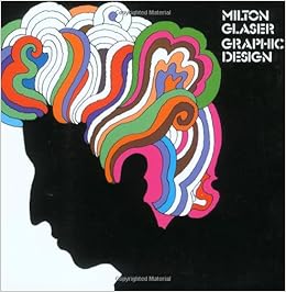
Milton Glaser

Milton Glaser, born in 1929, is a very well known graphic designer from the United States. He studied graphic design in Bologna, Italy under the full bright Scholarship at the academy of Fine Arts. In 2004, Milton received the lifetime achievement award from the Cooper Hewitt National Design Museum. He was the first recipient of the National Medal of the Arts award that was a graphic designer. Milton opened his own company for graphic design called Milton Glaser Incorporated. Milton was more recently known for his “Hope” poster involving Barack Obama. Milton is a prolific creator of posters and prints.

All information was found  in the link below.

https://www.miltonglaser.com/milton/#1

Image result for milton glaserImage result for milton glaser

Paul Rand

Paul-Rand.png

His early career was spent working for Apparel Arts and Esquire magazines and then joining the Weintraub agency. He was so successful that after a few years he demanded twice the pay for half the time, and got it. His relentless passion for corporate identity helped shape the American business landscape in the 1960s. The height of corporate identity design owed much to the unwavering pursuit of Paul Rand to make advertising more than just billboards. He worked in the field until the day that he died, at the age of 82.

Neville Brody

Neville Brody is a graphic designer known for his punk rock inspired style. This occasionally leads toa controversial piece, like his He’s done multiple album covers for musical groups such as Cabaret Voltaire and Depeche Mode. He graduated from the London College of Printing and the Hornsey College of Art. His design experience also ranges from  stamps to magazine advertisements to fonts. Currently he’s head of the Art and Design department at the Royal College of Arts. I find Brody interesting because of the fact that he’s worked in almost every area of graphic design. The ability to have freedom and not be stuck doing the exact same thing every day is why I am following a similar career path (Computer Art).

Find more about Brody here: http://www.historygraphicdesign.com/the-age-of-information/postmodern-design/531-neville-brody

Cipe Pineles: The Groundbreaking Feminist of Graphic Design

If you don’t know who Cipe Pineles is then you’re about to be blown away. Cipe Pines is the first female to climb the corporate ladder and make it as a woman in the male dominated field of graphic design. Not only did she get her work in famous magazines such as Vogue and Glamour but, she also became the art director for MULTIPLE magazines throughout her career, such as Charm, Seventeen, and Mademoiselle. She was also the first female member of the Art Directors Club and was their first woman put into their hall of fame. In 1955 she became the first and only female member of the Alliance Graphique Internationale until 1968. She broke the glass ceiling in everyday possible. Married and widowed twice to two famous designers, Cipe Pineles was a powerhouse and a force to be reckoned with. A modernist that changed the world of graphic design not only for woman everywhere but for graphic designers everywhere. For more of Cipe’s work check her website https://www.cipepineles.com.

Peter Mendelsund

Peter Mendelsund is known for his famous book cover designs. One of his most well-known pieces of work is his book cover for Stieg Larsson’s Girl with the Dragon Tattoo. His design for this cover is seen as being “the most instantly recognizable and iconic book covers in contemporary fiction.”

the_girl_with_the_dragon_tattoo

Mendelsund is also a well-known book cover designer for the author Franz Kafka. One of his designs can be seen in the image below for the book Diaries by Franz Kafka. Mendelsund has designed many of Kafka’s book covers, but this design stood out the most to me. I feel Mendelsund used a very simple yet unique way to design this book cover. The title “diaries” matches well with the multiple eyes with the key holes in them. The book covers design ties well with the title and gives off a very secretive vibe to the book which leaves viewers curious as to what lies within the following pages. I like how he styled the title in script so it looks handwritten, almost as if somebody was writing it in their diary. I also believe he balanced out the negative space very well with using different sized eyes that are either placed horizontally or vertically.

diearies-copy.jpg

Chip Kidd

Chip Kidd is a successful, American book cover designer. He studied at Penn State and later started designing book covers for a company called Knopf. There he would design 75 book covers a year. Today, he is their art director. He is also a published author. He created two books called Cheese Monkeys and The Learners. He also has freelanced jobs with various publishing houses. One job we may recognize was his design for DC comic book covers.

I chose Chip Kidd to explain to my peers that artists have many options for occupations. Chip Kidd has many sources of income, from art directing to collaborating with cartoonists and publishing houses. Therefore with graphic design the sky is the limit.

To learn more about Chip Kidd, check out this super informative website called  http://www.famousgraphicdesigners.org/chip-kidd


images (1)images (2)images (3).jpeg

Alex Trochut

Alex Trochut is a graphic designer mostly known for his work with typography. Born in Barcelona, Spain in 1981, he got his education in design at Elisava Escola Superior de Disseny. His first couple jobs included at agencies such as Toormix and Vasava. Starting as a freelance designer, he then created his own studio in Barcelona and is now located in New York City. He gets many of his inspirations from pop culture, fashion, and music. His style is best known for his ability to perfectly meld together images with words in their own unique design. Grabbing an aspect from an image and using that theme to put into his letter is what he calls letter translations. ​He states, “my work is expressive. it’s often highly detailed but the overall image is clean. I have a tendency to mix geometric and fluid forms. Ambiguity and duality are also recurrent themes in my concepts as are letters, numbers and symbols.”


Chip Kidd

cover

Chip Kidd is an American graphic designer, best known for his book cover designs and illustrations. He has worked closely with DC Comics, Amazon, Harper Collins, and many others, working on graphic novels and book cover illustrations. According to his short biography on famousgraphicdesigners.org, his book covers were said to be “creepy, unconventional, striking, and cunning.” He not only designed for many book companies, he also created some of his own novels. Kidd has won many awards for his outstanding work within the graphic design industry and is still well known today for his previous works.

Check out more about this fantastic graphic designer by clicking the link below:

Chip Kidd