Category Archives: #1 Graphics for Change

Blog Assignment #1

Cedomir Kostovic

Cedomir Kostovic is a graphic and poster designer born in Bosnia. He is now a professor in the Department of Art and Design at Missouri State University. Most of his poster designs focus on social issues from AIDS to the environment.

Here is a link to the rest of his work: http://www.cedoposter.com/index.html

Abram Games

Abram Games was known as one of the twentieth century’s greatest graphic designers, and was titled as the “Official War Poster Artist.” His most prominent work was created during the WWII era while working for the British. He uses striking visual imagery and high contrast to depict and promote the army forces. During his time as an influential graphic designer, Games described his own work and its relation to the public in this sense:
I wind the spring and the public, in looking at the poster, will have that spring released in its mind.
Games served in the army during WWII until 1941, when he was approached by the Public Relations Department of the War Office, looking for a graphic designer to make the Royal Armoured Corps a recruitment poster. One of his first designs would become one of his most notable designs, created in 1941 and nicknamed the “Bombshell Blonde,” which showcased an advertisement to “Join The ATS” (the Auxiliary Territorial Service.) Another one of his more famous pieces was the Festival of Britain Emblem, created in 1951.  He continued his work as a graphic designer for over six decades and eventually expanded his horizons to include subjects outside of his war advocacy.
abram-games-ats-poster-011920px-Festival_of_Britainabram-games-spades-ships-poster-01

Where Will the Birds Go?

Blog #1

Shane Luskie is from Australia who design this poster, simply asking ‘Where Will the Birds Go?’. He basically said about the sound of a chainsaw cutting all the beauty of the life, forcing it to end before it reaching the full potential was heartbreaking.

I choose this because its simple and to send an important message of people destroying the natural. Using the white color to represent the pure bird and there were only one tree left which with also a lighter color while the darker color as the death tree. Showing to people don’t realize to problem until its too late.

http://www.graphicadvocacyposters.org/posters/#/where-will-the-birds-go

Andrew Lewis’ Graphics for Change

Andrew Lewis is a graphic designer who works commercially but has also done graphics for advocacy, such as his “Learning is a human right”  and “Waste/Water” poster.

The first poster is advocating for, very obviously, the idea that it is not a luxury but a right for humans to learn and have access to education. The education system is barred from so many people because of the price tag on it, even though having an education is considered necessary to be “useful” in today’s society.

The Waste/Water poster is about the environment and how we as humans are wasting fresh water at an alarming rate. The earth is 71% covered in water, but 96.5% of that water is stored in the world’s oceans, which is undrinkable and, for the most part, unusable. We take water and our resources for granted, quite literally flushing it down the toilet without a second thought.

Information on Andrew Lewis and his work found on these sites:

https://www.alewisdesign.com/posters/

http://graphicadvocacyposters.org/posters/#/water-waste


Cedomir Kostovic

Screen Shot 2018-09-17 at 10.08.48 PM

Since 1992, Cedomir Kostovic has been teaching graphic design and illustration classes in the Department of Art and Design at Missouri State University. In addition to teaching, he has done creative graphic design work in social and cultural contexts like commercials, organizing international poster exhibitions, publishing critical essays and articles, and presenting lectures at various institutions. Cendomir has been extremly involved with the international poster scene since 1980, and has exhibited at most major poster events all over the world. His work has been awarded with over hundred national and international prizes and featured in many books, catalogs and periodicals, which deal with contemporary graphic design. The above poster is called “TRACES OF MAN” which was designed for the 7th Poster Biennial in Mexico on the theme Rights of Nature. It addresses the problem of uncontrolled exploitation of trees all around the world. To see more of his work go to http://www.cedoposter.com/social_posters.html

Craig Frazier: Sober Graduation

Flatdrunk.poster

Craig Frazier is an illustrator and designer, mostly known for his contributions to The New York Times, Time Magazine, The Wall Street Journal, and other publications. He began his career in 1978 and has been creating for primarily advertising purposes ever since, but he has also designed for postage stamps and children’s books. He has garnered numerous awards, including two silver medals from the Society of Illustrators, and he is also a featured artist in the Taschen book 100 Illustrators.

This poster, which he made for his local high schools, ended up being a success with the teens and, as a result, was published in Newsweek. One of the things that makes this image visually interesting is Frazier’s use of positive and negative space. Instead of placing a blank figure on a road, he makes the decision to put the road inside of the figure, leaving the viewer to envision a surrounding situation based on the message being conveyed.

http://www.craigfrazier.com/

#1 Graphics for Change

hold hands

This piece was designed by Alexis Lovely, a designer, writer, and artist from San Fransisco, California. She recently released a book of designs similar to this titled “Quotable”. The message of this piece is that we should perhaps hold hands with one another instead of worrying about holding guns. I really like this piece because it is so simple, yet also complex. I think the design choice to use such a bright background with a dark font was excellent, I think that it made her words stand out more. This piece is definitely more about the message than the actual design, but I feel like the minimalistic design here worked in her favor.

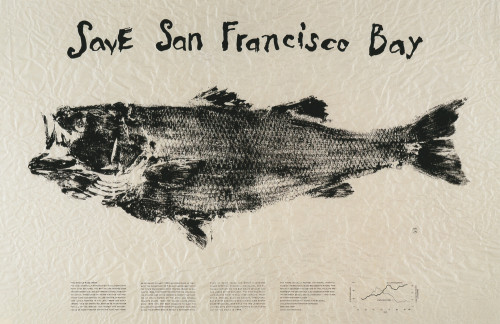
Save San Francisco Bay

This image, by Akagi, Doug, Powell, Kimberly was printed on recycled newspaper using a real bass that was coated in ink. It was then crumpled up to achieve a more textured look. The texture and the technique of using only black ink help translate the message of being environmentally conscious. I chose this image because its very simple while also delivering a powerful message. the use of a real bass was very interesting and the slight smudging from the technique gives the fish a dead look which further conveys the message that if we continue to live the way we are, all of the fish, not just in the bays but in the oceans as well, will die.14594_lg

Tomi Ungerer

tomi-ungerer-eat

Tomi Ungerer was born in France in 1931, and grew up during Nazi occupation. He immigrated to New York, in 1956, with only 60 dollars to his name. The following year he began publishing children’s books, including one of his most famous, Flat Stanley. Once the civil rights movement began, he started his antiwar and racial injustice posters. His poster EAT symbolizes, American forcing the Vietnamese, to conform to the “American way.” In his later years, he created posters, against animal cruelty, and nuclear disarmament. Over the years, he won many awards, including Frances, 1995 National Prize, for Graphic Arts, and the International, Hans Christian Anderson Medal, in 1998. I think his work symbolizes moral values, racial tolerance, and unification. He has incredible aptitude to influence the young and the old, using illustration and creative written language. If you want to find out more check out his website.


Steff Geissbuhler

blog post

Steff Geissbuhler is a graphic designer from Switzerland who has made a large impact with his artistic works. Geissbuhler is known to be one of “America’s most celebrated designers.” From architectural graphics to advocacy posters, this designer has been able to capture the eyes of many individuals all over the world. In the poster created by Geissbuhler shown above, he is commemorating “40 years since the bomb in Hiroshima, Japan.” The poster clearly shows two strong figures uniting and accepting peace between each other without the use of a lot of text. This graphic artist has many advocacy posters in his portfolio including posters focusing on AIDS, diversity, and “tolerance.” To check out some of Geissbuhler’s work click the link below and find out more about this talented artist who has an amazing way of communicating with the world.

https://geissbuhler.com/posters