Author Archives: BrookeMorawiec

Online Portfolio: Dribbble

Screen Shot 2018-11-19 at 8.53.32 PM

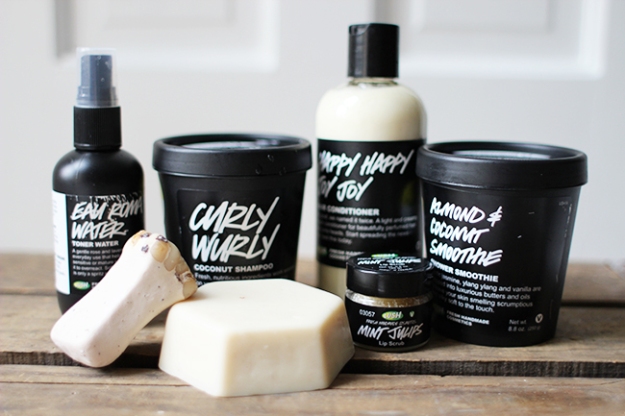
Dribble is a great resource for posting and marketing your portfolio while also looking into other artists work. Exposer is very important as a designer and there are many advantages to having your portfolio online. Some of the advantages of Dribbble compared to other portfolio websites is its free to create an account, showcase photos of different design works, processes and current projects, and to search and follow other designers for communicating design ideas. You can join various design communities as well as create your own blog on the website. It’s a very useful and resourceful tool to getting exposer, meeting other artists, and acquiring inspiration.

https://dribbble.com

Self Promotion- BLOCD

fgCBZnn4bBpCgRwv76tceK-650-80

Self-promotion is a very important aspect to staring a business or even just making yourself more know. Marketing yourself is an essential tool to becoming successful. By creatively self promoting oneself you make a statement not only catching the eye of potential clients but also making an impression. The design company BLOCD is created an edible Chocolate Pantone inspired business card. This unique design is both eye catching and memorable to the receiver due to the fact that not only is it cool, but the potential client gets to eat it too! http://blocd.com/en/works/blocd-typesetting-2/


Great Design Blog: Yellowtrace

yellotrace_logo_2

https://www.yellowtrace.com.au/category/graphics-illustrations/

Yellowtrace is a great design blog. Not only does yellow trace have subsections to find exactly what type of design work you’re looking for from graphics to fashion to architecture. Yellowtrace is a great resource to collect a variety of inspiration from a large collection of designs. Yellowtrace also talks about news in the design field and even design internationally. It’s definitely worth taking the time to explore.

Information design

A lot of graphic design is conveying a message and informing people. To do this one must draw the viewers eye. Hierarchy is very important in instances of information design. The most important information should be the focal point of the design. Colors, size, and font are different variables used to display importance of information.

Identity Systems: Lush


LUSH1

To create a recognizable identity a brand needs to create a memorable and consistent, yet unique and eye-catching aesthetic for themselves. A brand that does this perfectly in my eyes is the brand Lush. Lush’s brand campaign is mostly focused on the natural and fresh quality of their products as well as their cruelty free aspect of their products. Therefore their logo and packages are a classic black and white, with natural accents.

59a99334b065da24008b4a7d-750-563

Lush lets its products speak for themselves, exposing the product a lot of the time and letting the product itself catch the eye of the consumer. Keeping with their “natural” vibe the hand drawn quality for the names of the products compared to the very clean serif fonts with the description has a really nice fresh quality to it.

Lush-logolush2.jpg

For more of Lush’s products look here: https://www.lushusa.com
(couldn’t locate designer)

Pittsburgh Zoo & PPG Aquarium

Pittsburgh Zoo & PPG Aquarium

What drew me to choose the  Pittsburgh Zoo & PPG Aquarium logo is a variety of aspects. I usually have a tendency to choose very simplistic logos, but the complexity of the design really caught my eye. Upon first glance at this logo you just see a detailed tree with two birds flying out of the top. After a few moments of looking at the logo it’s use of positive and negative space creates not one, but two animal heads. Not only did it create two very distinctive and easily identified animals, but they’re very detailed and defined as well. On top of that at the bottom on the design are two (easy to miss) fish that appear to be jumping out of water. The level of attention to detail of this logo is quite astonishing. Unfortunately I couldn’t find the original creator of this logo.

Farm Freshfood

Farmfresh
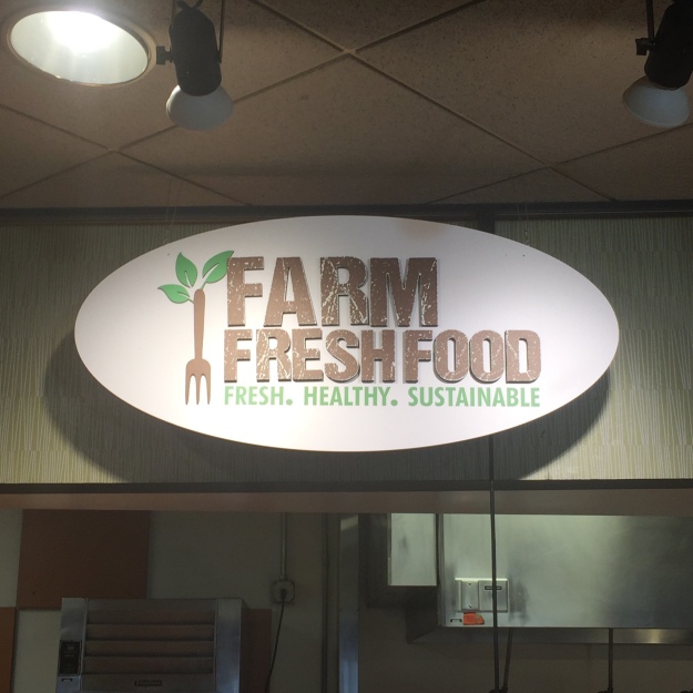
This logo really caught my eye today in Mills Dining Hall. Its color choice really embraces the earthy concept its trying to portray. The texture of the logo adds another level of depth that really reminds you of de-stressed barn wood. The graphic on the side is an interesting and eye-catching way to combine the idea of farm to table.

Cipe Pineles: The Groundbreaking Feminist of Graphic Design

If you don’t know who Cipe Pineles is then you’re about to be blown away. Cipe Pines is the first female to climb the corporate ladder and make it as a woman in the male dominated field of graphic design. Not only did she get her work in famous magazines such as Vogue and Glamour but, she also became the art director for MULTIPLE magazines throughout her career, such as Charm, Seventeen, and Mademoiselle. She was also the first female member of the Art Directors Club and was their first woman put into their hall of fame. In 1955 she became the first and only female member of the Alliance Graphique Internationale until 1968. She broke the glass ceiling in everyday possible. Married and widowed twice to two famous designers, Cipe Pineles was a powerhouse and a force to be reckoned with. A modernist that changed the world of graphic design not only for woman everywhere but for graphic designers everywhere. For more of Cipe’s work check her website https://www.cipepineles.com.

American Modernism: Graphic Design, 1920 to 1960

In this book the evolution of graphic design is discussed. I found it to be quite interesting that as times and technology changed so did styles and techniques used in design. Where heavily embellished lettering was later traded for clean simplistic styles when new methods of printing came out and how black and white led to color contrast when chromolithography allowed for the use of multiple colors. Not only did technology change print but so did current events. The more serious the event the more bold the designs became. Such as during war and internal political struggles. A good example being World War 2, anti nazi posters.


119419927_o4