Author Archives: merylmichelle

Great Design Blog

Es Devlin is an incredible artist and designer featured in various solo galleries, collaborations, operas, dance concerts and theatre events. that has worked alongside artists such as Kanye West, Adele, Jay-z, Beyonce, The Weekend, as well as other designers such as Louis Vuitton and Don Giovanni. Es takes craftsmanship of a space to a whole other level, which resulted in receiving the 2017 Longdon Design Medal, 3 Oliver awards, Evening Standard, Critics’ Circle and Wall Street Journal Innovation Award of 2016. Adding to her various awards she was elected a Royal Designer for Industry Theatre Design in 2018.


U2 – Experience and Innocence Tour.

Screen Shot 2018-12-11 at 3.59.08 PM.png

The Weekend – Coachella.

Screen Shot 2018-12-11 at 3.59.19 PM.png

The Weekend – Legend of the Fall Tour

Screen Shot 2018-12-11 at 4.04.10 PM.png


All of Es Devlin’s work can be found on her website here.
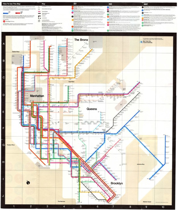
 

Information Design – Vignelli Subway.

A defining factor of New York City is the subway system. Intricate and used by millions of people yearly, there was a desperate need to understand the subway system routes, stops, and times. The designer Massimo Vignelli came to the rescue with the following design that had simplified the complexities which the official 1972 map of the New York subway system did. New Yorkers were expecting a geographical correct version of a map where as fellow designers applauded Vignelli for the more modern design.1972-Vignelli-NYC-Subway-Map.jpg

“For Vignelli, the map came down to a simple problem: knowing where you are and where you want to go,” explains Tochilovsky. “In the same context of the larger wayfinding system, a significant part of the map’s design strategy comes from withholding information that isn’t necessary, in an effort to make the experience of gaining the actual information that you do need much easier. The most likely scenario for the user is finding where you are on the line and counting the number of stops it takes to get to where you want to go. To Vignelli, this wasn’t a map of landscape; it was a system of logic”. SOURCE.


Learn more about Massimo Vingnelli here.

Identity System

0E2D6361-27B2-4FD2-B398-7558B30DD5B60F0E93C5-585C-4099-80A0-A50375463092

I thought a good topic to discuss four identity and designer would be Dunkin‘ Donuts, Who recently designed a new logo. It hasn’t been released to the local franchises yet though it’s on it’s way! Dunkin’ Donuts as often recognized by there sans Serif  font,  te orange and pink combination of colors often divided equally. The company is so large that if I asked what their logo phrase is most would answer America runs on Dunkin The company is so large that if asked what their logo phrase is most would answer “America runs on Dunkin.” They have created such a name for themselves that now they can remove half of their brand advertisement, they do this by removing the word donuts. Dunkin’ Donuts still serves her food and donuts and bagels and muffins etc. however they feel like they do not need to express that they have an offer these gi they have created such a name for themselves that now they can remove half of their brand advertisement, they do this by removing the word donuts. Dunkin’ Donuts still serves her food and donuts and bagels and muffins etc. however they feel like they do not need to express that they have an offer these goods. The color scheme still remains where the word Dunkin remains orange and the apostrophe is pink – if you notice on the first image that I provided the word and Dunkin is cut down depending on how large of a logo space is provided in a cup.


read more here

Ambiguity of Positive and Negative Space

The positive and negative space of this logo is astounding, who would have thought of this other than a professional designer? The way the black space creates the image of a quill pen, and yet also creates the illusion of a frame around a white spoon. The mere fact that a quill pen picks up, often black, ink to write with makes this logo not only impressive but extremely clever. The Guild of Food Writers has a successful logo. Moving back from the logo, blurring vision a bit, the outline of the black frame almost mimics a crest, found through out various guilds of history.

Unknown.png

This logo was designed in 2005 by 300million, one of the UK’s top agencies, whose website is no longer active. The creative directors were Matt Baxter and Martin Lawless, with Katie Morgan and Natalie Bennett working as logo designers.

Diet Coke; Over the Centuries – Seen in Real Life.

Over the years the logo of Diet Coke has evolved alongside its consumers. Seemingly effortless the design has continuously changed. The incredibly rich company pours a significant amount of money into marketing and researching how their product will sell best.

image1.jpeg

I chose Diet Coke for this example because Coca-Cola, as an original, has had less room to navigate change.

Did you notice the marketing change? Or did it always feel as though Diet Coke products looked just this way?

Take a quick look at how it’s changed over the years, and had been brought to a thick “high line” in which the typography is bold separated and in the words of Elyse Larouere, designer of the 2016 share a coke campaign, “It’s the graphic equivalent of Diet Coke’s confident, self-driven attitude.” Source.


DKOevolution2.gif

0D55DACB-A94A-4DA4-9C7C-CE5D97B50AA7

This piece is by Jessica Hirsche a designer and illustrator, for a Cards Against Humanity expansion pack based off the George Carlin’s Seven Dirty Words. This was a partnership client Cards Against Humanity and the Chicago Design Museum. Jessica is an experienced artist collaborating with various clients such as Etsy, Hershey’s, and Facebook. She creates “custom lettering artwork for established brands, classic books, postage stamps, and so much more.” Mentioned in articles in Forbes Magazine. Jessica is very in tune with what it means to be an artist down to the self-doubt people have when creating and over coming obstacles such as the various burn outs people go through and lists some tips on her webpage on how to overcome them. Check it out here.

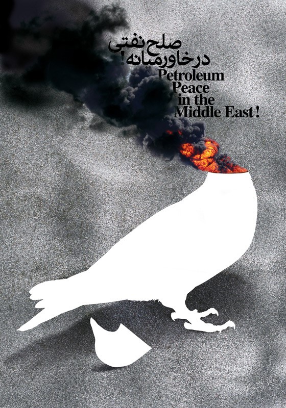
Parisa Tashakori – Petroleum Peace in the Middle East!

blog1


Parisa Tashakori is a graphic designer and art director from Tehran Iran. She is known for having over thirty exhibitions, assuming the role as panel judge for numerous international shows, hosting workshops, and receiving awards in Ukraine, Slovakia, and Iran. Parisa Tashakori often uses graphic design to touch on social justice and political issues that face the world community daily. Subjects such as war, the fight for democracy, women’s rights, waste production, voter participation and more. I chose this specific image because it is bold, shocking, and one of the leading causes of war through out the Middle East; Oil. The Iraq and Iran war, the Afghanistan conflicts, insecurity in Pakistan, instability in Kuwait and Lebanon, the American attack on Iraq in 2003, and various other wars that Parisa has experienced within her lifetime have influenced this design. The striking image of a dove, commonly utilized to represent peace, is beheaded with the head remaining next to the body, seemingly blown off from an explosion that is causing severe smoke. Next to the smoke is written, “Petroleum Peace in the Middle East!” in a valiant effort to communicate that  “even if peace is declared, it will not be a reasonable and logical peace. Oil, this divine gift, is and will be the primary cause of insecurity, and we will continue to see many crises as long as this material exists in this part of the world.”


The size of this image is 27.6 x 39.4 inches.

Image Source

Parisa Tashakori Website