Author Archives: lauren press

Peter Mendelsund: Read, Think, Design: Create Stunning Book Covers

I found the Peter Mendelsund’s NPR interview to be very interesting. I never realize how much thought is put into designing book jackets. I was surprised when he was explaining how he usually makes 100 variations of designs on one book jacket. Peter Mendelsund explained how every book has a mood. Designers show the books mood using different colors. After the interview, I looked at some of his designs online. I found them all to be unique and interesting to look at. When I was looking at his book jackets I was defiantly able to understand what he meant when he said every book has a mood.

Peter Mendelsund’s NPR interview

I found the Peter Mendelsund’s NPR interview to be very interesting. I never realize how much thought is put into designing book jackets. I was surprised when he was explaining how he usually makes 100 variations of designs on one book jacket. Peter Mendelsund explained how every book has a mood. Designers show the books mood using different colors. After the interview, I looked at some of his designs online. I found them all to be unique and interesting to look at. When I was looking at his book jackets I was defiantly able to understand what he meant when he said every book has a mood.

PRINT Magazine

In the article, The Seduction of Romance-Novel Design Gail Anderson explains her history with romance novels. She explains how she has been reading them since she was a teenager and now her job is to design them. Anderson explains how the romance book cover design is driven by sales. Most romance books have a similar typeface and photographs on their cover. Familiarity in typeface and layout lets the reader know exactly what kind of book it is. I found this to be interesting because it contradicts the saying “you shouldn’t judge a book by its cover.” Continue reading

Online Portfolio

Behance is a free online website that designers can use to post their work. This sight is very popular for people to post their portfolio. This website allows you to post work along with look for jobs. There’s a full section on this website dedicated to finding jobs in the creative field. On this website, I found someone’s portfolio for their package design for a line of skincare. I thought the design and packaging looked very professional.  This website shows you how many people have viewed your portfolio, along with being able to like peoples work. You are also allowed to follow peoples accounts who you like. I thought this was a really cool website for designers to use.

Screen Shot 2018-11-19 at 4.00.12 PM.png

https://www.behance.net

Self promotion design

creative-business-cards-4-36.jpg

When looking for an example of self-promotion graphic I came across this business card. This business card is for an event photographer. I thought this business card was really unique because it looks like the view finder of a camera. This business card is able to give people the information they need to get in contact with the business, while being unique. I think this photographer will be successful because of how unique their business card is.

Design Blog

One graphic design blog I found to be interesting and useful was Typewolf. This blog was all about different styles of typography. This blog contained fonts you could download, lists of trending fonts as well as font recommendations. Typewolf has a section on it where graphic designers list their favorite fonts. I found this blog very interesting to look at. There’s so many different fonts that I’ve never seen before. I think this blog is very useful if you need advice about different styles of type. Fonts have a large impact on the feel of a design.

link to blog

https://www.typewolf.com/blog/industry-leading-designers-share-their-favorite-typefaces

Information Design

Screen Shot 2018-10-29 at 4.16.24 PM

As a coffee lover I find information about coffee really interesting. I liked this poster because of all of its coffee facts. You can easily tell what this poster is about with just a quick glance. I think the information is presented in a really clean way. I like the way the designer of the poster incorporated the use of different color and size type. By doing this the designer is able to put emphasis on different parts of the poster.

Cool Facts About Coffee

Pandora


Pandora Media Inc. is a music streaming service that was created in 2000. ­ Tim Westergren the creator of Pandora, wanted to create a separate, individualized radio station for each user. The service plays songs that have similar musical traits. Pandora is can be accessed through the mobile app or through the web. People can listen to the music for free, but there will be advertisements. Listeners can choose to pay each month for add free music, as well as being able to download music and listen to it offline. In 2018, it’s been reported that Pandora has 71.4 million users. Pandora’s logo is the word “Pandora” written in light blue against a white background. The logo features two bright colors to help it pop. The design is simple and clean. The font used is a simple sans serif. Pandora never gave the artist who designed the logo credit for their work. The mobile apps icon is a P with the bowl removed that’s bight blue. I think it’s interesting that they decided to make the mobile icon a P instead of having the full logo. Pandora often modifies their logo to show the different music styles they offer. They do this through a wide variety of different designs and photographs. By doing this Pandora is showing their versatility as a company.


Girl Scouts logo

4c5e25aa28fc3.image

Saul Bass designed the Girl Scout’s logo in 1978. The Girl Scouts program is meant to teach young girls important life skills like leadership, technology, outdoors skills and many more. The Girl Scout Leadership Experience makes these life lessons fun through fun activities like earning badges, going on trips, selling cookies, exploring science, getting outdoors, and doing community service projects. The Girl Scout logo is green and white and consists of three faces of women, diagonal to one another. Through the use of positive and negative space the logo is simple but is able to have meaning. Saul Bass has also designed the AT&T, Dixie, United Airlines, and the Quaker oats logos.

http://www.saulbassposterarchive.com

Blog post 4

graphic design poster 2
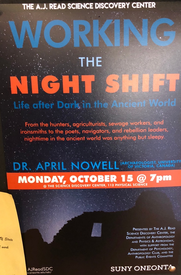
I found this poster in hunt. When I first looked at it the contrast between the dark background and the orange and white font caught my eye. I like how the designer chose to put stars in the background along with tree silhouettes. By doing this the poster helps show its message.