Author Archives: heatherward

Wix.com

Screen Shot 2018-11-19 at 5.39.21 PM

Wix is a great website that can be used to make a very creative visually stunning display. It has a ton of awesome features that can help you personalize and communicate whatever the site owner wishes. Although marketed towards small business owners, I find that Wix can be useful to anyone. For graphic designers or freelance artists, for instance, Wix would be a good tool to create a portfolio with. It is very easy to use, and that is one of the main reasons I decided to use this rather than to create a website from scratch. Sometimes I’ll go to the Wix discover page and check out the other sites that people have created. Visitors can subscribe to your site if you post any new content, events, etc. To have a custom domain, users must pay $24.85.

check out my site: www.simply-heather.com 

Jessica Hische

See the source image

Jessica Hische is a freelance graphic designer based in California. Her main focus is on creating custom lettering artwork. I find that her work is very recognizable, as she has a very stylish, colorful way of bringing her letterforms to life. I had actually first recognized her work from some book covers she designed.  What attracts many of her clients (such as Papyrus, Tiffany & Co. , Wes Anderson, Hallmark, etc) is her classic typographic style, and her ability to create designs that really communicate more in just words than pictures alone. For every client she can create a custom design that gets the right message across. I, personally, am a big fan of hers.

This is Paper

Screen Shot 2018-11-05 at 11.18.37 PM

I found this to be a very interesting website as a source of inspiration for the modern contemporary artist.  Thisispaper.com is an innovative design studio based in Warsaw that specializes in all types of art. From graphic design to publishing prints, event planning, etc, they also run a successful magazine and clothing/accessory brand. Many of the collections of photographs I found on their site were put into categories, so if someone were to look specifically for architecture, interior design, etc., they can use this site as a good resource. I particularly liked one of their posts on the interior architecture of a chapel.

check them out at https://thisispaper.com/

Information Design

grPHIC DESIGN

As I was scrolling through Pinterest looking for something that had efficiently displayed its content in a unique and interesting way, this image had stuck out to me the most. The dark navy color in the background contrasts well to every other color on the page and is not as dark as black so all of the text is easier to read.

There are several different types of graphs on the page to provide visuals for all of the information that is being displayed. The color choices regarding the graphs work very well together because they are all of a similar tone and are very light in contrast to the background. The colored text (numbers, software, etc.)  represent key factors, and the artist uses the negative space in the page to his advantage, as he shows numbers with the negative space as well.


Visual Identity: Airbnb

Related image

When Airbnb decided to redesign their logo, they had focused their attention on having one, more iconic symbol. The company had asked DesignStudio to accomplish this. So, they had simplified the logo from the word “Airbnb” to just the icon. The icon takes into consideration all four aspects of what the company is really about, which is a very good idea as far as creating a visual identity for themselves. This design makes it more internationally friendly, as the unique symbol is recognizable virtually anywhere, whereas the brand name would pose a language barrier. Also, with unique colors and patterns used in advertising, versatility with such a simple design is not much of an issue.  Such an identifiable shape makes it easier for marketing, too (in regards to printing and branded products). I think this new design was a very clever idea.

Click here to read more


Positive and Negative Space

1a6a0f86c3911cce2d2ee996a4ff6486.png

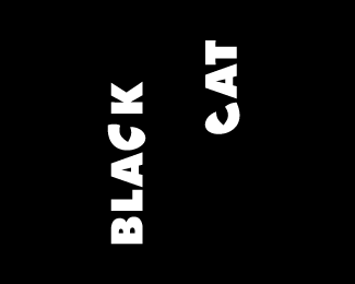
I think this logo design is a perfect example of good unity between positive and negative space. This was created by logo designer Peter Vasari for a TV production company. Not only do the black and white colors contrast each other, but the artist aligns the words “Black” and  “Cat” so the letter “c” in each word would line up evenly.  He then utilized the two letters to mimic a pair of large cat eyes. Though a fairly simple design, I was impressed with how I first was drawn to the pair of mysterious eyes poking out of the dark.

For more of his work, go to:

http://petervasvari.com/

Seen in the Real World

IMG_8327

I saw this poster as I was walking in the Fine Arts Center, and out of all of the posters hanging, this one stuck out to me most. Although I believe the kerning is a bit unbalanced in spots,  this poster communicates a very open concept for the space. The inclining door supports this as its open door lets out light and a trio of colors that spread to the bottom of the page. The title of the headline is very contrasting to the rest of the colors and background of the page, therefore sets a bold statement. The vertical text, although difficult to read, help bring movement to the page as well as the words that follow inside the white borders. The leading is very tall so the text is very easily read. With these aspects, the design will help guide the eyes to all corners of the page which is a major plus, since this is about great scholarship information!

Saul Bass


Saul-Bass(web)

Saul Bass (1920 – 1996) is an iconic name in the graphic design world. As a child growing up in New York City, his drawings were the beginning of his career. After taking art classes during college, he left New York for California where his work for advertising agencies and logo companies took him incredibly far. His logos and other designs are famous, many of which we’ve seen in films, posters, or next to the name of big companies. Bass had a simple, minimalistic style that he contributed to many of his. works. This, however, did not lessen the effect that they brought to his clients and viewers. Bass was, “committed to injecting life into these graphics, making them as much a part of the cinematic experience as anything else”. Introducing his signature “kinetic type,” Bass’ letters dashed and moved across the screen and frequently incorporated images other than text.

To Read More…

Graphic Design: A New History

IMG_8120IMG_8123

I was actually looking forward to going to the library and doing a bit of research on graphic design. I browsed through a few books and I did find many things worth writing about, however I did want to shed some light on a particular subject. I was interested in what I read on the Digital Aesthetic. A very popular trend in the 1990s, artists sought after a visual style that would signify the magnificence of the coming age of technological wonders and achievements. The main goal of the Digital Style is to show how the study of the graphic design development of the Internet may benefit by employing a central concept from art and design theory, the concept of style.

In contrast to the “expressively distorted work” of grunge designers, these digital artists liked to create pieces that would have an aesthetic appeal similar to those found in video games. I think that it is clear that in many of the digital graphics of the 90s, very intense, almost surreal digital graphics were very popular.


Octopus Vulgaris by Jude Landry

octopus vulgais

Jude Landry is a graphic designer and professor at UNT’s College of Visual Arts & Design who specializes in branding, lettering & illustration. This poster was created in 2010 to raise awareness of the 2010 Gulf of Mexico oil spill. The image shows a large octopus/sea monster (personification of the oil spill) rising from the depths, with a deadly grip on the Gulf states. These states, damaged by the oil spill, have put themselves in harm’s way to help feed America’s need for oil. Landry wanted to advocate that while drilling in the Gulf creates jobs and helps serve our current energy needs, the damage done by this spill will cripple the fragile coastal region for many years.

Although this is Jude Landry’s only advocacy poster, I believe that it sends a strong message.