Author Archives: erikaspraker

Online Portfolio

weebly

Weebly.com is a site where you can create an online portfolio or website for personal or business uses. The setup is very easy and it has step by step guidance on how to use all its features. They provide a variety of  themes you can choose from and you can also customize different elements as well. I like this site because it allows for a good amount of freedom with creativity and you don’t need background knowledge to be able to use this. The basic plan is free to use however if you want additional features there are other plans that cost from $8-$25. In the picture above you can see a few themes you can select from. https://www.weebly.com/

Self Promo

bc

Featured above is a business card for a photographer/videographer. I thought this card was a very creative and fun idea that went with the theme of the business. Just by looking at the card for a second you can tell what the business is for, and then by taking a minute to read the provided contact information you can find out further details. I like how it is simple and to the point, but the transparent material with the hole in the middle to ‘look through’ the camera is a fun and unique concept. The designer is Jeff Achen and the link to his website to find out more about him is: http://jeffachenvideography.com/tablet/index.html


Design Blog

blog.pngWhen researching different design blogs, I came across this blog that caught my eye called Old Brand New. The Blogger, Dabito, contains numerous titles including interior designer, photographer, graphic designer and more. His blog contains different categories of art, travel and life, but mostly focuses on interior design. In 2015, the magazine Better Homes and Gardens included him in their Best Decorating Bloggers. What was appealing for his blog was the bright, clean, and modern look of the layout of the pages. Each post was simply placed in rows with a colorful picture to draw readers in. Also, the shapes at the top of the page spell out the name of the blog which is a creative and abstract way to include a design aspect. Overall I thought this was a very appealing design blog for everyone to check out at: http://www.oldbrandnew.com/blog/
 

Information Design

info

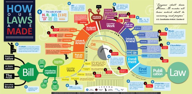
Here is an example of an information design that explains how our laws are made. The design incorporates eye pleasing colors along with a variety of shapes to organize the different segments of information. The shapes that the information are organized into is the most important part of a design and I think this graphic is successful with that. Also the path the shapes creates allows the viewer the read the information in the order needed. I thought this design was interesting because of the amount of colors they use which would draw viewers in to want to read this poster.

Mike Wirth and Dr. Suzanne Cooper Guasco designed this.

Identity System

Yellow Deli has an identity system that has always intrigued me from when I first became familiar with the restaurant. The logo contains flowy writing and flowers which carries into the rest of their theme with the restaurant décor and menu. The menu also consists of flowy writing that looks as if someone doodled on the entire menu. I love how the logo and menu designs tie into the design of the restaurant. The nature and free form flow of everything ties together well. Although the designer is not stated on their website, for more information their website is: http://yellowdeli.com/oneonta

yel.pngOneonta Sandwiches


Ambiguity of Positive and Negative Space

See the source image

The logo in this picture is from NBC, which stands for National Broadcasting Company. This logo that has now been around since 1986 is one of the most widely recognized logos. I have always found this one intriguing due to the creative use of negative space. As you may know, the image represents a peacock with the white negative space in the middle being the body and the colorful shapes being the feathers. The now 6 feathers are meant to represent their 6 divisions: news, sports, entertainment, stations, network, productions. When the peacock first originated, the designers John Graham and Herb Lubalin meant for it to symbolize the increase in colored programming. As the logo changed over many years, the modern peacock logo was designed by Steff Geissbuhler, and has been slightly modified since. The use of the negative space is simple yet affective, because the audience can still recognize the picture right away. I think the logo has developed into a clean and creative piece, and their website can be found at, https://www.nbc.com/

Seen in the Real World


This graphic design was from a protein powder box I had in my pantry. This design stuck out to me due to its creativity with the typography. Looking at the logo alone, the clean look from using simply the text makes it an effective logo. I love the way they made the word ‘fit’, fit tightly in between the other letters. Also, the contrast between the black, white, and red really makes it stand out. As for the design on the rest of the front of the box, emphasis is properly put on the logo, then to the picture, and finally to the smaller details. There isn’t an overcrowding of information, but still includes necessary details. Overall I love this design, logos that include designs with only text are usually my favorite because of how simple, yet strong they can be.

Alex Trochut

Alex Trochut is a graphic designer mostly known for his work with typography. Born in Barcelona, Spain in 1981, he got his education in design at Elisava Escola Superior de Disseny. His first couple jobs included at agencies such as Toormix and Vasava. Starting as a freelance designer, he then created his own studio in Barcelona and is now located in New York City. He gets many of his inspirations from pop culture, fashion, and music. His style is best known for his ability to perfectly meld together images with words in their own unique design. Grabbing an aspect from an image and using that theme to put into his letter is what he calls letter translations. ​He states, “my work is expressive. it’s often highly detailed but the overall image is clean. I have a tendency to mix geometric and fluid forms. Ambiguity and duality are also recurrent themes in my concepts as are letters, numbers and symbols.”


Go: A Kidd’s Guide to Graphic Design

The book I chose that caught my attention in the library was Go: A Kidd’s Guide to Graphic Design by Chip Kidd. Although this is a book intended to teach younger ages about graphic design, the content and information was actually very knowledgeable. It starts with giving a run through history about graphic design all the way from art in 15,000 B.C. The chapters are broken down into 4 categories: form, typography, content and concept. The chapter that interested me the most was typography. I’ve always loved the idea of using text to create a design and making it the focal point. It ties in with the idea of ‘less is more’ being that there are no pictures to distract you from the message in the text itself. I love the quote Chip Kidd says on the page above saying, ” Even though it is in black and white, the beautifully nuanced balance of tones, proportions, and textures makes it a monochromatic rainbow of type”. I think this describes typography in general perfectly. Many people underestimate the power of text by itself, but text alone can become a piece of art that consists of many different design aspects that need to be taken into consideration when placing words. Kidd tries to emphasize that text can be more than just words in a straight line, you just have to think in a more abstract way.

McRay Magleby

poster

McRay Magleby is a graphic designer who graduated from Brigham Young University in 1969. Later on, he worked as creative designer for BYU Publications and Graphics and a professor of Illustration at the University of Utah. Now well known for his poster designs, one of the many posters he was commissioned for was the Cultural Olympiad poster in the 2002 Olympics. Pictured above is his Wave of Peace poster he designed to commemorate the 40th anniversary of the Hiroshima bombing. The soft colors and simple design give the tranquil feeling to represent peace. The silhouettes of the doves in the waves also symbolizes the peace, and the wood like texture in the water represents Japanese wood carvings to incorporate Japanese culture. Through teaching many of his students about his passion of graphic design, one of his famous quotes about creativity is, “Being creative is risky; however, where the risks are great, the rewards are greater.”