Google is the world’s most popular search engine, with a relatively simplistic colour and design layout. Its clean interface allows for easy navigation, and its company continues to evolve and change with time. What was once a company whose primary function was to be a search engine, it has evolved into one of the largest companies in the technological industry. With such a large range of possibilities, Google honed in on the specific elements that have worked to shape the Google identity into one to make Google “more accessible and useful to [their] users.”
A new brand identity makes Google more accessible and useful to our users.
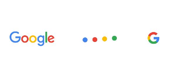
The elements that make up Google’s brand identity include the Google Logotype, the Google Dots, and the Google G. Standard across all of Google’s platforms (including the Google Chrome symbol, though not shown above) is Google’s four – colour palette. These easily recognizable colours help to tie together the differing Google elements and create the association between the colours and the company.
You may learn more about the development and the company by visiting here or here.


