Author Archives: christianlangenfeld

Cell Phone Information Design

Image result for information design

This design reflects on the use of cell phones and how they have become a dominant part of today’s society. This design is interesting to me because of the color schemes used here. The Black/light gray background works well with the popping colors of the yellow, white and blue shades. The different sized fonts and images used draw in readers as well. Overall it is a very well put together design.


Visual Identity

Sonos is a brand of wireless speakers that was developed in Santa Barbara by its four founders, who had a vision to reinvent how devices communicate with each other and to change our overall experience listening to music. In 2011, as Sonos prepared to launch an exciting new product, they asked Bruce Mau Design to help rethink the brand identity. I think that Mau used both modern and simplistic ideals to promote this change. Although the speakers are just small black boxes, they provide a huge amount of sound experience. The logo with the the word “sonos” in the center and orange lights spreading out represents this well. In the image above, the advertising represents exactly what Sonos is trying to expand amongst their users— lively surround-sound experience that gives almost a “concert-feel”.

Beats Logo

The Beats By Dr. Dre logo was created by Ammunition design company. The design features a red circle with a negative white space used to create the “b” in the middle of the logo. If looked at closely, the design can be seen as someone wearing the headphones as well. The red circle with the “b” outline creates the illusion that the “b” is a pair of headphones and the way the circle is shaped and positioned, the illusion of a person wearing headphones is created. Ammunition design worked with beats to create a simple but majorly effective logo to help the product get going. Beats is now owned by apple and is one of the most famous audio headphone companies in the world.

Beats

Unknown.png

Real Life Poster

What I enjoy about this poster is the theme. The theme is something that is illustrated throughout the poster and stays consistent with the images, border, and text. The text title is something that is bolded and almost glowing to pop off the page and grab the viewers attention. The text explaining time and dates is a nice white color to pop in the dark background as well. Another part I like about the poster is the striped border on the top and bottom of the poster. When I saw it my mind thought off a movie reel. It appears to almost come right off the image of the movie reel itself. The Last thing I like is the arrangement of the pieces in this poster. The image is centered as well as the text and almost draws you in at the top and slowly brings you down the poster until you reach the bottom of the poster.

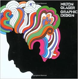
Milton Glaser

Milton Glaser, born in 1929, is a very well known graphic designer from the United States. He studied graphic design in Bologna, Italy under the full bright Scholarship at the academy of Fine Arts. In 2004, Milton received the lifetime achievement award from the Cooper Hewitt National Design Museum. He was the first recipient of the National Medal of the Arts award that was a graphic designer. Milton opened his own company for graphic design called Milton Glaser Incorporated. Milton was more recently known for his “Hope” poster involving Barack Obama. Milton is a prolific creator of posters and prints.

All information was found  in the link below.

https://www.miltonglaser.com/milton/#1

Image result for milton glaserImage result for milton glaser

New Typographic Design

The book I chose when browsing through the library is “New Typographic Design” written by Roger Fawcett-Tang with an introduction and essays by David Jury. I chose this book because I am a big fan of typography in graphic design and It is one of my favorite elements that can be used for a design.

The part of the book that I believed to be the most eye catching to me was the part of the book with examples and a short paragraph about the Synopsis Project. Synopsis was an example of whats known as the “DaMa font.” The DaMa font is a font created by the DaMa logo by Dalton Maag. The logo was turned into a complete set of a font for every letter and number that can be used. The Synopsis Project used the DaMa font and softened the hard edges of the font using “graduated color tints.” This work was done in 2005.

Image-3.png.jpegImage-2.png.jpegImage-5.png.jpeg

Red Polar Bear Graphics for Change

red-polar-bear

Image result for Bjargey Ólafsdóttir

Bjargey Ólafsdóttir is a photographer and painting artist from Iceland. She did a collection of artwork known as “350 Earth” in which it encourages people to start considering climate change and other aspects of nature that are sometimes overlooked. One photo was known as the “Red Polar Bear.”

This polar bear was drawn into the snow to show that the ice is melting and the red coloring represents the killing of polar bears because of this. The campaign includes artwork and images painted out on the earth to the size where it can be seen from space if looking from such a distance. The goal of the campaign is to get people to start advocating and start learning how to make a difference.

All information came from the link below.

https://www.hongkiat.com/blog/public-awareness-artwork/