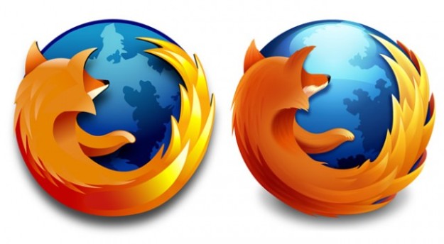
Firefox’s logo is very recognizable, to the point that everyone knows what it represents when they look at it. The logo includes a fox, but no one thinks that it has anything to do with wildlife conservation or anything of the sort. People know, because it has a set identity, that it represents an internet browser. The logo has changed a few times since the Firefox browser was originally released, becoming slightly more minimalist in the more recent past. The original logo was designed by Alex Faaborg, and Mozilla, the parent company of Firefox, continued to alter it, but the logo essentially remained the same due to its inherent identity.

This logo is the most recent, and the one you will see if you download Firefox on your computer or smartphone today. It is far simpler than the original but still implies the same. The contrasting colors have always been eye-catching, but this iteration makes the orange parts far more hot and orange, and the blue part much cooler and bluer. It creates a very captivating contrast. The blue area, which was originally a globe, has been reduced to merely a blue ball that the fox appears to be curling itself around, but many people will still subconsciously register that it is supposed to represent the world, helped by knowing the original Firefox logo and also by the identity held in most internet browsers that claim to connect you to the entire world. The fox is not as detailed as it used to be but it is still very clearly a fox, pertinent to the browser’s name, “Firefox”, and making the logo unmistakable.
http://alumni.media.mit.edu/~faaborg/index.htm

I find this logo very fascinating. This is the first time I have noticed the fox and I love designs that play with its imagery with positive and negative space. Its also really great branding how they have simplified the logo over the years. The simplifying of the colors and making it more 2D makes it a better design especially for reprinting.
LikeLike