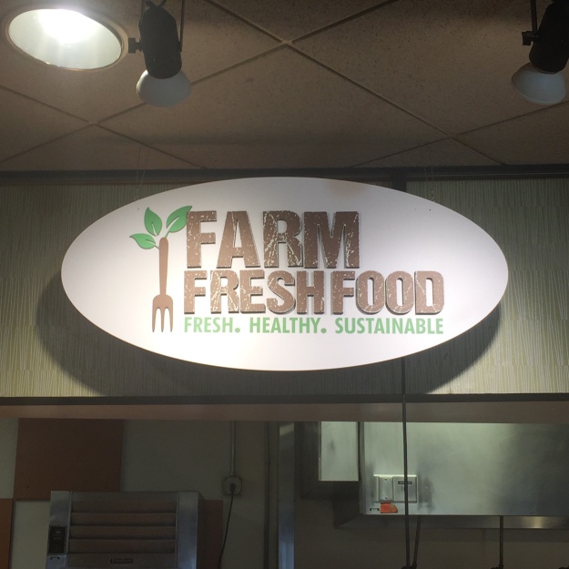
 This logo really caught my eye today in Mills Dining Hall. Its color choice really embraces the earthy concept its trying to portray. The texture of the logo adds another level of depth that really reminds you of de-stressed barn wood. The graphic on the side is an interesting and eye-catching way to combine the idea of farm to table.
- Comment
- Reblog
-
Subscribe
Subscribed
Already have a WordPress.com account? Log in now.

I like this logo and I’m surprised I never noticed it in the dining halls. I like the simplicity of the design and how the designer used only 2 colors. Green and brown are earthy colors which is why i believe they fit the Farm Fresh Food logo well. I also really enjoy the graphic on the left and how they combined a fork and a plant together to help portray a healthy message.
LikeLike